Coming soon…

UberConference
Case Study
Time: February 2013 - December 2013
Scope: UI, Visual Identity
Role: Visual Designer
UberConference is a visual interface for traditional audio conference calls.
Seeing who's on a call cuts down on lengthy introductions, eliminates the problem of not knowing who said what, and can help troubleshoot technical issues by identifying the source of static or other background noise. Convenient scheduling features mean that UberConference can even call attendees for you, eliminating the need for PINs.
UberConference launched at TechCrunch Disrupt 2012. The initial designs were completed by a contract employee. Following the launch, I worked with the UX team to redesign and rebrand the UberConference experience for web and mobile.

UberConference 1.0
UberConference’s dashboard at launch.
Research
Initial user feedback was negative. In particular, the experience of interacting with the dashboard, the first screen users see when they use UberConference, was confusing:
Information hierarchy was poorly structured - the highest priority feature, starting a “New Conference” was lost in the header. Almost half the screen was used to show upcoming conferences that could be weeks or months in advance and was often filled with the same recurring conferences. The feature that occupied the most visual space was a list of the user’s past conferences.
The design system was ambiguous - UberConference’s skeumorphic design was chosen for cosmetic reasons, rather than utility, and the interface featured a stylized woodgrain conference table background, paper textures, and 3D elements. Users mistook the depth and shadows applied to “Your Number” and “Your Pin” as clickable buttons. The design language didn’t follow clear rules and contributed to user confusion.
Conference View
UberConference’s visual interface in action.

The conference view had usability issues as well.
Key features lacked discoverability - UberConference’s visual interface gave organizer’s the ability to mute or kick conference attendees, but many users weren’t aware of these features because they were hidden. To reveal them the organizer had to click the UberConference logo on a participant.
We’ve all experienced painful conference calls. UberConference’s mission is to make conference calls easy, but certain features had the opposite effect:
Too much user control led to a negative conference experience - the “earmuff” feature enabled the organizer to mute the audio for an individual at any time so they couldn’t hear parts of the conference - effectively isolating them from the conversation. This feature was intended to provide more control, but people thought it was “disturbing.” Seeing who’s talking is one of UberConference’s core features, but its implementation also included a list of past speakers. This caused anxiety for people who worried they were speaking too little or too much.
Finally, UberConference’s messaging was missing the mark with our target audience. Users didn’t understand the value prop, “See who’s on the call.” Most thought it was a reference to videoconferencing. In fact, videoconferencing, screen sharing, and document sharing were features that users expected and that competing services offered, but UberConference didn’t. Meanwhile features that UberConference promoted, like not needing a PIN, were contradicted by the two PIN numbers displayed to users throughout the app.
Instead of offering the most features, we decided to focus on providing the best conference experience, so we crafted a new mission statement to guide the redesign.
Mission Statement
The stress-free conference call.

Goals
Help people have better conferences
We can do this by iterating on our most valuable features, by adding any missing features that our users expect, and by removing unnecessary features that complicate the service. The end goal is to create a service that makes it easy for you to start and manage your conference calls.
Establish a clear design language
To support the previous goal, an effective design language should create consistency, promote efficient interactions, and provide a flexible foundation for future growth (videoconferencing, screen sharing, document sharing).
Highlight the advantages of using UberConference
Finally we want to create a strong brand identity that communicates the benefits of using UberConference.
Wireframes
Sketches from the team’s brainstorming session explored ways for users to express their “Music Identity” through Stories.
Exploration
We began by exploring improvements to the dashboard and conference screens because they are the main screens users will interact with. The improvements we made informed the designs for all subsequent screens.
Dashboard
The dashboard lacked clear hierarchy, so we ranked its features to determine the elements to prioritize.
Start now
Schedule conference
Next conference details
Your info (#, PIN, URL)
Upcoming conferences list
Past conferences list
The redesign places emphasis on starting a new conference or scheduling a conference for later. To focus the user’s attention, these features are in the center of the page and surrounded by white space . Starting a conference now has a higher priority than scheduling a conference later based on urgency.
Details for your next conference are clustered near the start now and schedule later buttons. Your contact information (phone number, PIN, URL) is always available at the top of the page. We added a button to copy your UberConference info for easy sharing. Finally, we removed the lowest priority features - your upcoming conferences and past conferences lists - to simplify the page. They’re available on a separate “History” page.
Conference
To improve feature discoverability, we removed the button to access participant controls and automatically surface them when a user rolls over an attendee’s avatar. Our data showed that most conferences are made up of 5 or fewer people, so we optimized with larger avatars. We also switched from a circlular to a rectangular shape to open up the platform for videoconferencing features to be added later.
Based on user feedback, we cut “earmuffs” and the list of past speakers. UberConference’s visual interface means you can see everyone on the call, making it easy to identify and remove anyone who shouldn’t be there. For V2 we remove PINs by default, but if a user wants more security they can re-enable PINs through a new “Lock” feature. Finally, we added our two most requested features, screen sharing and document sharing. After the conference ends, a summary is automatically emailed to everyone with a list of attendees, conference notes, and links to shared documents.
Component Libraries
I designed component libraries that could be applied to the wireframes for testing.

After we established the wireframes for the dashboard and conference screens, the UX team build out the subsequent flows and interactions, and I focused on improvements to the design language.
I performed a UI audit of the current design to identify the components we would need. Using these elements I explored different combinations of color, type, iconography, and animations. I created component libraries to quickly apply these styles to the wireframes for testing. I liked the idea of keeping UberConference’s blue for consistency, but I adjusted the hue for stronger contrast and added green, dark grey, and orange for visual impact.
The previous design relied on skeumorphic elements to establish the visual identity. These elements created confusion and made the brand feel stuffy and outdated, so I replaced them with a flat style for simplicity. I incorporated spot illustrations for personality and was careful not to show retro technology that would our service feel old.
Illustrations
Various illustrations I made for the app and homepage.


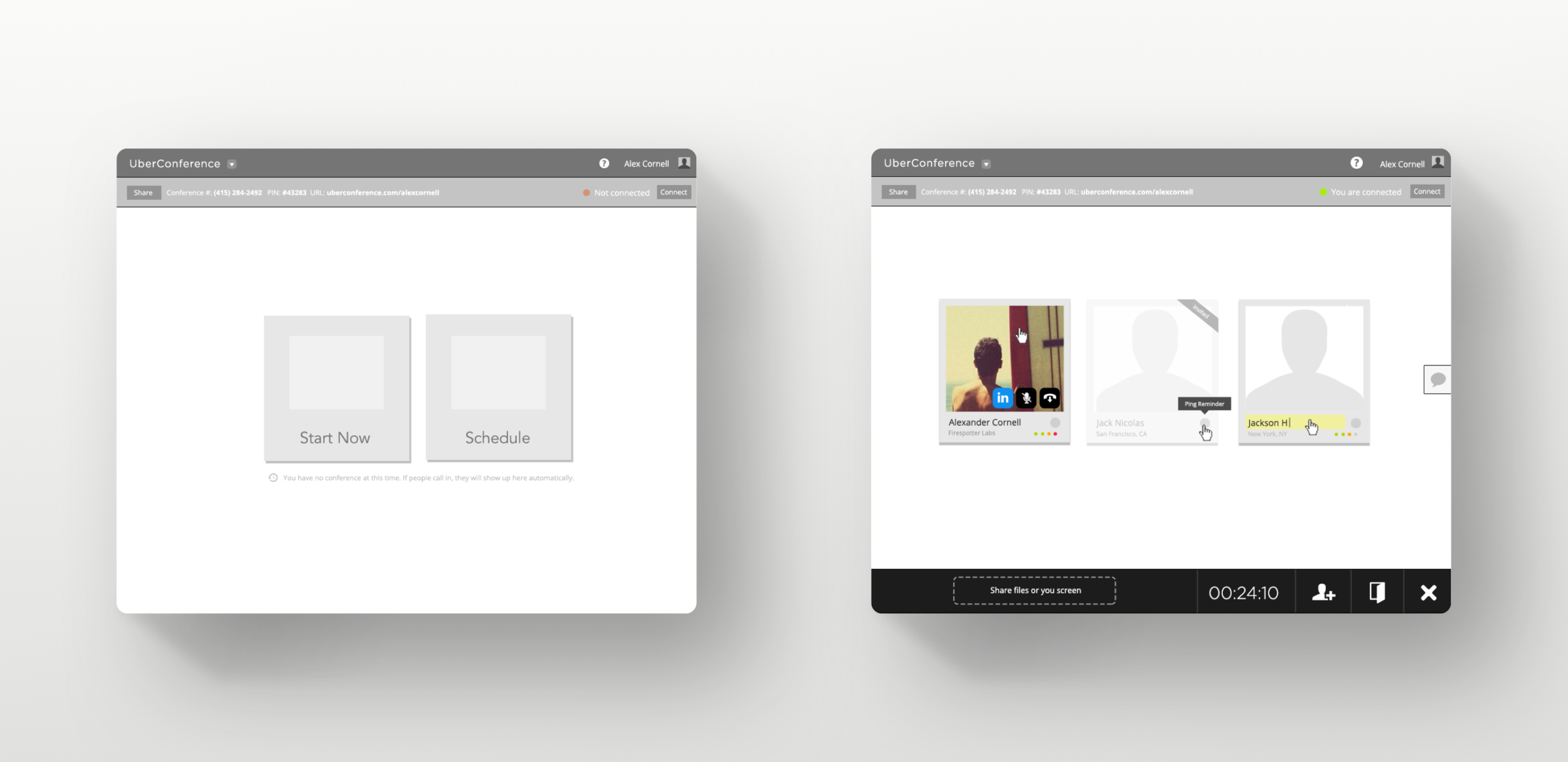
UberConference 2.0
The new and improved UberConference 2.0 dashboard and conference views.

UberConference 2.0
The UberConference V2 dashboard and conference screens with the new design language applied. The dashboard welcomes users to their conference room and provides instructions to guide their first interaction with the product. There are now clearly labeled buttons for “Start Now” and “Schedule” with descriptive text for each, and a working clock and calendar add visual interest to these interactions.
For UberConference 2.0 we set out to streamline the user interface with clear user actions. We accomplish this by breaking up tasks and limiting the choices we present at each step.
I created animations to show off the flows of starting a conference, scheduling a conference for later, and interacting with conference controls.
Start Now
asdfsaf
Schedule
asdfasd
Conference Controls
asdf
We also use descriptive text in the conference view to improve discoverability of new features like screen sharing. Old features like invite, record, lock, and hang up also display descriptors on rollover. In addition to the larger participant avatars we included icons for the user’s connection type: desktop, mobile, or phone line. This allows people to know whether other attendees are able to see their screen or shared documents.
Mobile App Redesign
adfaf

The mobile app’s smaller screen size did not accommodate the desktop’s skeumorphic design. This led to an inconsistent experience between the two apps. Woodgrain background of the dashboard is replaced by an animated gif of an empty workstation.
Avatars are in squares
Past speaker list gone.
Buttons weren’t styled like desktop buttons, but like the non-clickable elements from the dashboard.
The new visual language maintains consistency between the
Mobile App Before
The UberConference 1.0 mobile dashboard, conference, and history.

Start a Conference
The mobile flow for starting a new conference.

Launch Posters
I illustrated a series of posters to celebrate the launch of UberConference 2.0.

Branding
We want UberConference to be the “stress-free conference call,” so we updated the brand with friendly language, ample white space, and clean illustrations to make our service approachable. We can’t say we are the stress free solution and have a complicated UI. Likewise, our messaging couldn’t be uptight.
Drop the umlaut. Previous logo emphasized Uber, new logo brings parity /makes them the same hierarchy. Cleaner visual execution.
Friendly language - show don’t tell - To get rid of wordy feature lists on the homepage I created looping animations that highlight the benefits of UberConference to new users.


Homepage
Artists like Selena Gomez and Charlie Puth are using the feature to engage with their followers.
Homepage
We had a lot of text saying how simple and easy UberConference is, but since our audience had trouble understanding the benefits of the service, I thought it would be better to show rather than tell. I made looping animations to demonstrate our key features to new users. It engages users without resorting to a bulleted list.
Upgrade Flow
I illustrated a series of posters to celebrate the launch of UberConference 2.0.


Upgrade Flow
At every step we focused on making the service friendly and approachable through language, improved legibility, and ample use of white space. Again, the UI and branding have to work together at all points to deliver the same message. We can’t say we're simple and easy to use and have the interface be heavy and bloated with unnecessary features. We service can’t be streamlined and yet we use wordy, feature check list language.


Homepage
Artists like Selena Gomez and Charlie Puth are using the feature to engage with their followers.
Welcome Email
The previous “Welcome” email intimidated users with information overload. The new email encourages people to explore the service by starting their first conference. It’s signed by members of our support team to humanize our service.
Impact
Following the redesign, UberConference won the bronze prize for “Best Everyday Utility” at the 2014 UX Awards. The improvements led to a 3.6x growth in users within a year and over a quarter billion minutes of conferences every month.
Improvements
Save shared files with conference notes for participants
Remove rollover controls. Testing would later reveal that still too hidden. Visible all the time.
Icons too illustrative, render simpler. Simpler illustrations in general.
Next Steps
The integration with Facebook Stories features improvements like audio clips and a more noticeable Spotify playback link. Future iterations of the feature could leverage Canvas to create stronger visual Stories that utilize the strengths of the platform.
We know from talking to both fans and artists that sharing music is one of the easiest ways to express a mood or tell a story. We’re excited to see all the different ways our creator community will take advantage of this new functionality. Happy sharing.
— Spotify for Artists

Animated Prototypes
I created prototypes to show how users could share their music habits with compelling Stories.