
Dialpad
Time: January 2015 - March 2016
Scope: UX, Design System, Visual Identity
Role: Visual Design Lead
Dialpad is the evolution of Switch to a full-featured enterprise phone system.
Switch was originally developed for small to mid-sized businesses who could benefit the most from the cost-savings of a cloud phone system. We didn’t anticipate that large companies would be eager to replace their existing hardware and infrastructure. The Motorola partnership attracted other enterprise customers with complex needs: department lines, call centers, support queues, faxes, and many other features that were not included in the original scope. Each new feature made the app more complex and difficult to use.
I led the visual design team through the redesign and rebranding of Dialpad across mobile, desktop, and web.

Switch
Multiple windows were difficult to manage. Multiple departments made color association confusing.
Research
The Switch UI was not designed to incorporate many of the features that were added later. Too many functions were added to a small footprint.
Multiple windows were confusing. They got lost on users’ desktops and made it difficult to find active calls and conversations. Users wanted a single window to move around.
Color was used to represent different meanings depending on the context. A green button was used to answer an incoming call, but a blue phone icon was used to start a new call. A green dot represented an active user but a green badge could mean a department notification. Your own active status was colored blue. The use of color was confusing.
The app felt sluggish and unresponsive. Launching a new product is a lot of work. Engineers were more focused on the back end and making sure everything was working properly. As we got closer to launch we had to cut back on the animations, and as a result, the interactions lacked finesse, leading to an uncanny valley effect where the animations made the app feel slow- better not to have than be slightly off.
The design needed room to breathe, and as we continued to pursue larger customers we had to work fast. As part of the contract for deployment, we promised Motorola an interface update in X months. Given the tight timeline, the initial scope for the redesign was to stick the two windows together and increase the widths. That was not ideal, so I pushed for a more comprehensive redesign.
so I explored expanding to a full screen UI.
Ditch the multiple windows
Add enterprise features like departments, support queues, etc. Redesign the Switch interface to allow for customization and an expanding feature set
Quick implementation with little engineering work
Single Window Explorations
adfasdf


Exploration
I explored single window designs to unify the Switch experience and contain user interactions.
I worked with engineers to limit the changes to type, color, and scale updates that could be implemented quickly.
I worked with the engineering team on small style changes that could be implemented quickly. We were mostly limited to colors and type style changes. With only slight modifications we were able to make significant visual changes. These are some of the initial mocks. The bottom image is from an exploration that was scrapped because it would have required too much engineering time.
I restrained the use of color to highlight important information and interactive elements. The switch from a dark to light theme reduces the app’s visual weight.
We initially used the dark app theme to set us apart. For the move to the full screen app I switched it to a lighter theme so it didn’t feel so heavy. The small footprint of the previous design was cramped. Now a single, large window contains the UI. New features that allow for company departments, locations, call centers, and sales and support teams. Use cases where the app is the main focus - always up, and can benefit from more real estate to display info. We also got rid of a lot of the animation work to create a more mature, enterprise product.
Additional Screens
asdf

I applied the updates to key screens like “Search,” “Missed Calls,” and “Contacts” to evaluate its impact on primary user interactions.
The bottom-right image swapped the layout of conversation and profile information. It was scrapped because it required too much engineering time.
Switch Redesign
adfasdf

Switch Redesign
The single window UI frees the design to use scale and white space to more effectively establish visual hierarchy.
Active calls and conversations are given focus, and the additional space allows for new features like video calls and document sharing.
Compare specific screens and detail changes
Active call
Actions are arranged at top.
Pare down colors /distractions - multiple meanings, streamline to missed calls, blue and grey only. Green to pick up
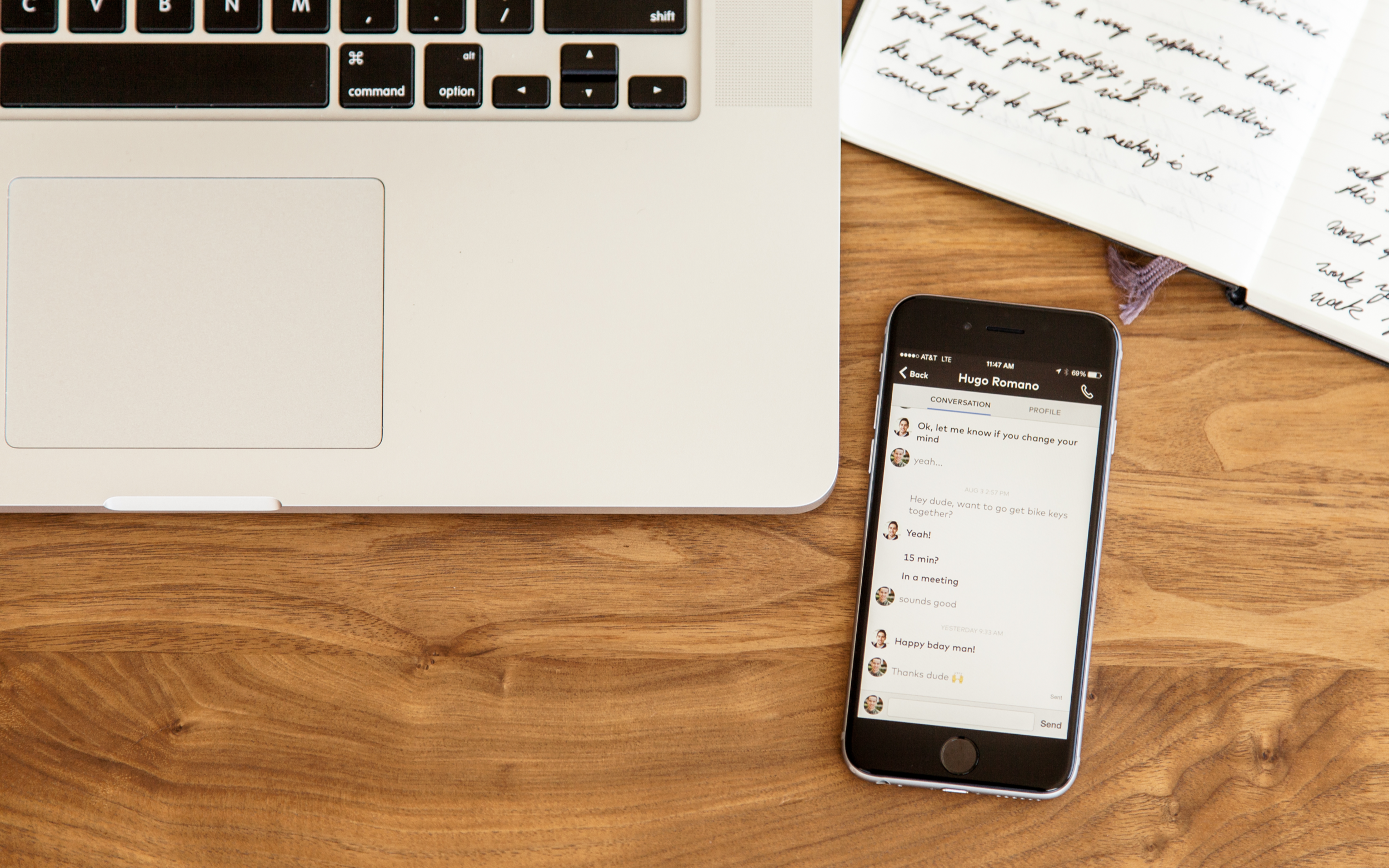
Conversation View
ladkj;d

Utilize established visual cues to decrease mental load of using app - conversation - blue/grey text, indents - with so many event types, staggering the information helped with readability finding important content faster
Switch Mobile Redesign
adsfasd

The “Recent,” “Conversation,” “Active Call,” and “Profile” screens after the redesign.
Even on mobile, I use additional whitespace to free up all the information.
Switch Mobile App Before
The “Recent,” “Conversation,” “Active Call,” and “Profile” screens before the redesign.


Recent View
It’s important for users to be able to change their active status when using their personal devices for work.
The previous design required users to tap on their profile to view or change their status. Users often forgot to switch their status back the following day.
The redesigned Recent view displays the user’s status prominently at the top. If the user enables “Do not disturb” mode, a banner appears as a reminder and allows the user to quickly change their status.
Active Call Flow
adsf

The previous Active Call screen had two rows of buttons. The top row was a mix of common actions (mute, hold) and lesser-used features that benefitted from text descriptors (transfer, record).
The redesign puts emphasis on the most frequently used in-call features: mute, hold, dialpad, and speakerphone. They are given a more tappable button shape and are positioned away from the bottom to prevent accidentally pressing “Hang Up.” More complex features are available through an action sheet.
VoIP/carrier status and switching are merged. Most users will only want to interact with this feature if something is wrong, i.e. their connection is weak. The new design warns users of poor connectivity and prompts them to change their connection with a tap.

Conversation States
Switch was designed first and foremost as a voice communication service. The conversation view emphasized call activity with color-coded call events, but this meant messages receded in visibility.
The new conversation view builds upon the visual patterns of speech bubbles to improve conversation readability. Messages use indents and spacing to clump distinct message threads together.
The redesign also adds new features like video calls, transcripts, document sharing, and more to the conversation view. These events are styled with more noticeable icons so they are easy to find and follow up with.


Branding
The shift to enterprise also meant changing our messaging. Our service connects people, so we wanted to incorporate a human element through photography. We didn’t have a budget for a professional photographer, so I art directed and shot photos to build a stock library for the marketing team.
The shift to enterprise also meant changing our messaging. Our service connects people, so we wanted to incorporate a human element through photography. Feedback from the marketing team was that they needed more graphics to use in their marketing materials. They like the illustrations, but they needed more flexibility/options. We wanted to build a library of images for them. We didn’t have a budget for a professional photographer, so I art directed photo shoots based off stock photography examples from the marketing team. They wanted shots to represent the office environment. The themes were: collaboration, connection, mobility, and the interaction between people and devices. These shots represent the mobile office, and highlight that Dialpad is a seamless tool to enable you to work on the go. The last set of shots are examples for other verticals like education.
There was an issue with the Switch copyright, so we
Also in the corner you see the name Dialpad. It was with all these changes going on that we were involved in a naming lawsuit. Combined with the shift in our target audience and the changes to the UI and branding it made sense to do a rebranding. The only problem was we were on a very tight deadline, 2 weeks. Since we didn’t have much time to do explorations, Whitney and Astra focused on logo explorations while I focused on the word mark itself. One of my regrets from designing the Switch logo was not spending enough time on the word mark, so this time I wanted to make sure it was bold enough to stand alone. These are some of the concepts. And type. The final word mark is a modified version of Einstellung. The rounded letterforms drew inspiration from old rotary phones. I also made a few alphabet logos just in case. The short time frame meant that there wasn’t much opportunity for back and forth, so it was easier to push our recommendation through. We finally moved away from the alphabet logo. You can see the final mark in action in this video I illustrated and animated for the homepage.
Dialpad Rebranding
During the redesign Switch was involved in a naming lawsuit. Combined with the shift in our target audience and the changes to the UI, it made sense to do a rebranding. I created an animation to celebrate Dialpad’s launch.
Impact
Redesign that allowed Dialpad to grew 443% in revenue between 2013 and 2016, landing it in Deloitte’s 2017 Technology Fast 500, and today the company has approximately 200 employees.
* Redesign to aligns with enterprise-focused sales strategy, serving businesses with 20,000+ users
* The company offers a cloud solution used by nearly 50,000 businesses to give employees access to voice, text, video, and conferencing from any device.
*Selected by U.S. News & World Report as a Best Business Phone Service for 2020.
Following the redesign, Dialpad grew 10X and was averaging 25 million call minutes per month.
Launched end of 2014
2014 1.4k users
2015 22k users (10x growth)
03/16 25 million call minutes a month
Over 300 million call minutes a month w/ Omniad


Photography
adf