Coming soon…
Switch
Switch is an enterprise cloud phone system from the makers of UberConference.

Case Study
Time: 8 Months
Team: App Integrations
Role: Visual Design Lead
Instead of investing in costly dedicated phone hardware, companies can assign a single number that works across an employee’s existing devices – mobile, desktop, and even traditional phone lines. As Switch's visual design lead I was responsible for the creative direction of the brand and UI from the initial concept to launch, and managed the execution of the visual style across desktop, mobile, the website, onboarding experience, emails, videos, marketing materials and branding.
Our head of design, Alex, left before we started developing Switch so the core design team was 2 UX designers and 2 visual designers.

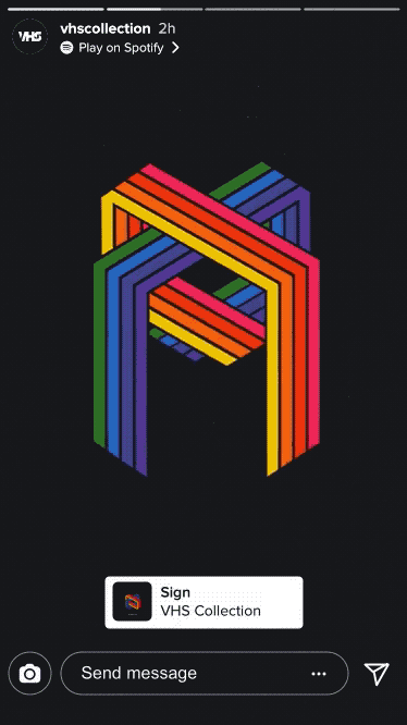
Now Playing
A screenshot of Spotify’s “Now Playing” view shared on Instagram Stories.
Research
Working on a conference call project brought to light many issues of corporate phone systems.
As we set about designing an enterprise messaging, voice and video communications platform from the ground up we looked at existing services in the space.
Competitive Analysis: Ringcentral
Getting a business off the ground is costly. There are big startup costs involved from office space, IT, etc. Setting up a company phone system is another. Many employees have their own mobile devices and in some cases prefer using them, why not leverage existing hardware to reduce startup costs?
We targeted small businesses with less than 50 people. These were the companies that we hypothesized would not want to invest in costly dedicated hardware and would benefit from leveraging existing mobile and desktop devices.
We chose not to target large companies that would already have phone systems since we reasoned that they already invested in the hardware infrastructure and would not want to get rid of it or risk trying a new system.
Cloud communications was already a crowded space before we entered it. But looking at some of the biggest players in the industry, we saw an opportunity to streamline the experience like we had with UberConference. The idea was to have limited functionality, but do it well.
Mission Statement
To simplify the process of setting up and administering an enterprise phone system.

Goals
Like UberConference, Switch had less features than competitors. Instead of focusing on features we focused on streamlining the experience of using a cloud phone system.
Design a unified communications tool that streamlines the experience of using multiple devices (desktop, mobile, landline) and communication methods (call, text)
Leverage existing devices - don’t require costly servers or desktop equipment. Take advantage of a cloud-based service to offer seamless transfer between devices.
Easy to set up - In the past, setting up a business phone system took as long as several weeks and required an expert to walk you through the process. Signing your team up for Switch can be completed in less than a minute. By integrating with Google Apps domains we can even pull your company directory to make deployment painless.
Easy admin controls - Allow customization through robust, but clear settings
Music Identity
Sketches from the team’s brainstorming session explored ways for users to express their “Music Identity” through Stories.

Exploration
We took a similar approach as the UberConference redesign with the two UX designers, Jerome and Jason, working on the wireframes. They experimented with full screen and candy bar style designs, but settled on a contact list launcher. The idea was that the app would stay open on a user’s desktop, similar to a chat program. Making a call would open a separate window. While they worked on the flows, I explored visuals and interactions for the desktop app. I also focused on information hierarchy - what is the most important information to show the user at at any given time.
Animated Prototypes
I created prototypes to show how users could share their music habits with compelling Stories.
Mixing Calls and Messages - iOS Splits
One of the problems we were solving was mixing different event types. When we developed Switch in 2014, it was still a relatively new idea to mix text and messaging functions into one service. Apps like Facebook Messenger & WhatsApp were still primarily messaging focused apps. Voice calling features wouldn’t be added until a year later in 2015, after Switch launched. Slack launched in August 2013 but didn’t add voice features until 2016. iOS still has separate apps for calling and messaging. Their wireframes focused on event types to bridge the gap between these two mental models and they included icons for incoming/outgoing messages and calls. Early mocks even included a separate inbox that you can filter to focus on only calls, messages, or voicemails.
Google voice screenshot or WhatsApp or _____
Prioritize Time Sensitive Information
From UberConference V2 we learned the importance of showing the right information at the right time to guide user’s to the most important actions. Taking a step back, what’s more important to the user, the communication type or the person you’re communicating with? I explored designs that focused on people and replaced the event icons with user avatars. I still kept the event type, but it became secondary information, displayed through supporting text that tells you if the communication was a call, voicemail, or a text message with the a preview of the message.
The shift to people changed the inbox model to a recent contacts list. Using the dropdown menu you could filter the list to view the company directory or specific departments. The inbox was changed to a “History” tab to differentiate it from “Recents.” Events in “History” could be sorted by “All” “Missed” or specific event type like voicemails or calls.
Notifications - Priority to New Events
With so many different events coming it’s important to have clear user notifications. I explored a Notification Center at the top to highlight events you missed. Since the recent list below shows who’s communicating with you, the notification brings back the event icons to show you at a glance what type of message you missed - whether it’s a text, call, etc.
Since the app would remain open on your desktop, I thought the notification center would be a good opportunity to show other relevant information - time/date, weather, usage stats. This last mock was me playing with the idea of having a screen type interface at the top of the list that displayed different information depending on the action you were taking. I was inspired by consumer products like the Teenage Engineering OP 1 synthesizer and Nest thermostat. What really impressed me about nest was how they designed something that made you want to interact with it - through transitions and animations. And so I landed at this mock, which is pretty plain in comparison, but relied on animations so that it felt alive.
Now Playing Explorations
I explored different executions to visualize a listener’s “Now Playing” status. AR lenses made a return in the form of headphones with music notes and song info animating above the user’s head. Other filters featured Spotify playlist branding, with song info replacing playlist titles.

Think Clear vs Task management (GTD) apps. How do we make a contact list stand out? Focus on making experience delightful. Animations, feedback, make users want to complete actions based on feedback.
This is a recording of a clickable demo I created in Adobe Edge. Since so much of the design relied on interaction it was important that we could play around with the interface. A context sensitive info pane at the top of the contact list displayed notifications for new events and reinforced the area as the focus of the user’s interactions.
Tapping a contact opens up a message thread. Earlier wireframes had it defaulting to a profile view, but again I wanted to focus on the communication so I defaulted to the message thread since that is the most time sensitive information. Event icons come back into play in the thread history where you can see voicemails, missed calls, etc.
Like UberConference, we were in the position of launching with less features than our competitors, so the goal was to streamline the experience of using a traditional phone system. One of the benefits of Switch is that it uses employees existing devices. So Switch has standard call controls like hold, mute, and speakerphone, and using these functions are similar to the experience on a user’s smartphone. Switch goes a step further to make it easy to do complicated phone actions - like transfer a call. Instead of having to press a series of arbitrary numbers on a desktop phone, you can search for the person you want to transfer to. If you answer a call on your desktop but need to head out, you can seamlessly “switch" (hence the name, also switchboards) the call to another device.
Share to Instagram Stories
The Share to Instagram Stories user flow.

Setup
Another area we focused on streamlining was during sign up - Phone systems are notoriously complicated to set up. Signing up for some of our competitors can mean calling a sales person and setting up an appointment for them to walk you through the process. By contrast, signing your team up for Switch can be completed in less than a minute, and typically takes new customers less than 10.
Inspired by Virgin airlines process of purchasing a flight. It makes the dry process of selecting a flight snappy and easy to understand. Again we followed the principles set by UberConference to limit the actions being presented to the user. Adding animations makes it feel snappy. We used illustrations, animation and interactions to make the process engaging and delightful. By integrating with Google Apps domains we can even pull your company directory and make deploying your team easy.

Story View
Viewers can tap the link at the top of the Story to listen to the song on Spotify.
Switch
Here are screens for the final app.
Branding
Once we passed off all the assets to engineering, we focused on the brand. As we continued to build out the messaging the idea that Switch was “The phone that works the way you work" spoke to our ability to work on whatever device the user chose. Our low cost meant that we could scale to meet the needs of most businesses. These are some illustrations I created to represent that idea. We liked the idea that we were the phone for workers of the future, so we created some messaging around that. These are some more illustrations we used in the app, and on boarding on the desktop and mobile. Again we try to be playful with our language and imagery to differentiate ourselves from other phone services. The style also incorporates visual elements from our sister product, UberConference. Ample white space, use of blue, a logo featuring a letter, illustration style and tone. Strong contrast and bold graphics are used to create visual energy.
These are some logo explorations I did. Again, staying within the family meant that they preferred an alphabet based icon. The dots was a fun way around that because in morse code an “S” is represented by 3 dots. Three dots also represent incoming messages on modern phones, so it was a fun was to incorporate the past and present of communication technology. The final logo was a “S” that resembled two speech bubbles interacting.
Feature Launch
The feature was announced on stage at F8 in May 2018.

Impact
Switch and Motorola made history when they signed the largest single contract for a cloud phone service. Motorola chose Switch over established competitors like Microsoft and RingCentral for its low cost and ease of use.
Artist Tools
Artists like Selena Gomez and Charlie Puth are using the feature to engage with their followers.

Improvements
many animations didn’t make it for launch. This left the app feeling slow or unpolished. Important learning that when launching a new app, don’t try to do too much with visuals, visual polish comes second to stability of core features.
Next Steps
The integration with Facebook Stories features improvements like audio clips and a more noticeable Spotify playback link. Future iterations of the feature could leverage Canvas to create stronger visual Stories that utilize the strengths of the platform.