Switch
Time: February 2014 - October 2014
Scope: UX, Design System, Visual Identity
Role: Visual Design Lead
Switch is an enterprise cloud phone system from the makers of UberConference. Instead of investing in costly dedicated phone hardware, companies can assign a single number that works across an employee’s existing devices – mobile, desktop, and even traditional phone lines.
I was responsible for the creative direction of the UI and brand from concept to launch and managed the execution of the design system across desktop, mobile, and web.
Mobile Wireframes
Switch is a unified communications system that unites phone, instant messaging, and SMS. It’s important to highlight missed calls and messages, so early mobile concepts centered around an inbox to make it easy for users to follow-up on new events.
Desktop Wireframes
Switch also unifies a person’s existing mobile and desktop hardware so calls and messages are accessible across all their devices.
Wireframes for the desktop app explored full screen and candy bar style designs before the team settled on a contact list launcher. The benefit of the contact list’s minimal footprint would allow it to stay at the forefront of a user’s desktop. Making a call or interacting with a contact opens a new window.
We merged the “Inbox” and “Recent Contacts” views to streamline the flow of interacting with new events. Folding new events into contacts also refocuses the app on people and creating conversations.
UI Explorations
Working from the UX team’s wireframes, I explored different layouts for navigation and information hierarchy. From UberConference V2 we learned the importance of showing the right information at the right time to guide users to the most important actions.
I explored a Notification Center at the top of the app to call attention to new calls and messages. I also experimented with using the Notification Center’s empty state to display information like time, date, weather, and usage stats. These additional states were removed to focus on the most important vital user information, new events.
I developed a clickable prototype so the team could test key user interactions.
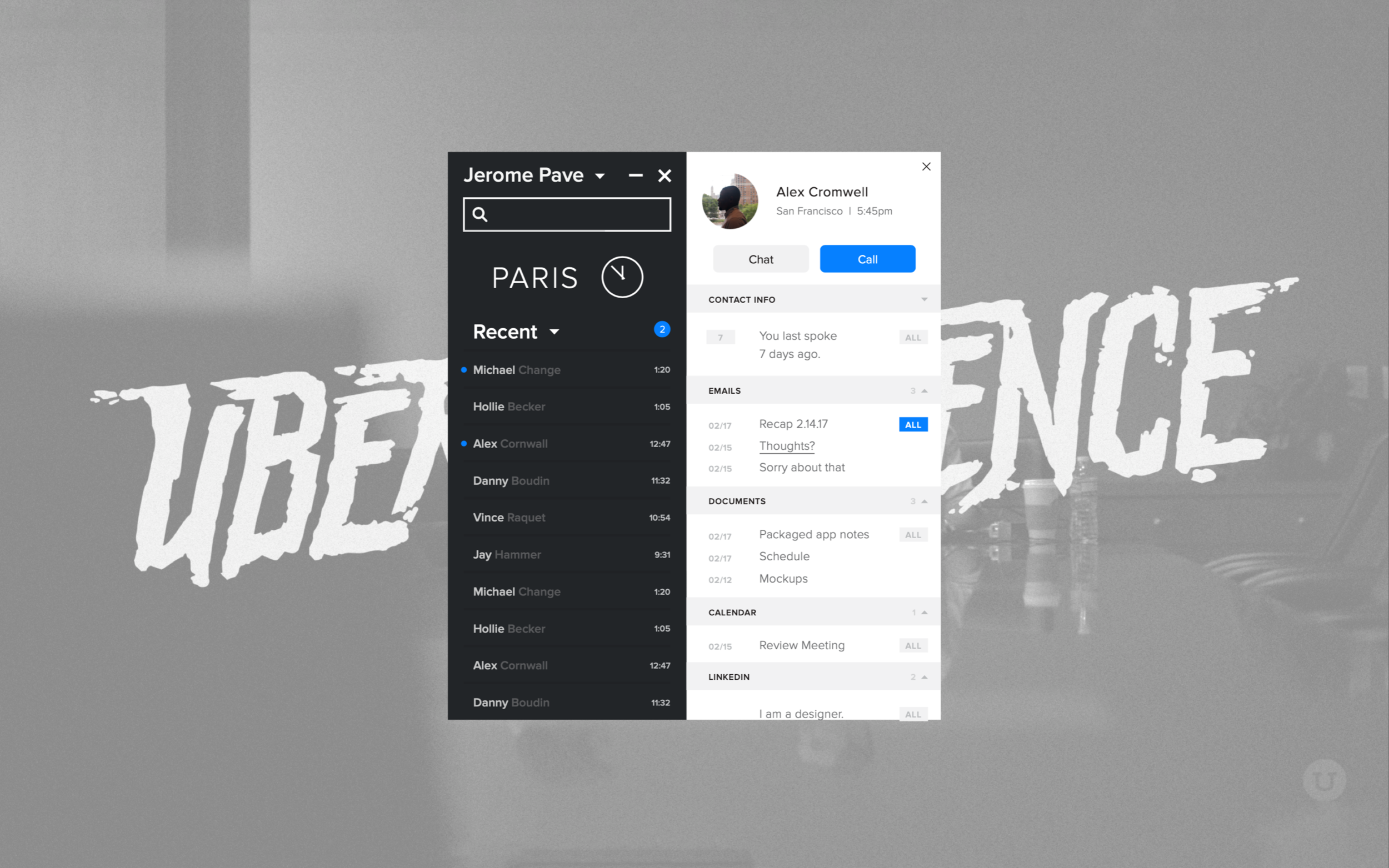
Switch Desktop
The Notification Center’s final design uses color to provide a glanceable indicator for missed events. I used contrasting light and dark themes to differentiate between the active conversations and the contact list.
Tapping a contact from the contact list opens the message thread. Earlier wireframes adopted a phone centric model of opening the person’s profile, but internal testing revealed Switch’s principal use as a messaging app, so the final design defaults to the conversation view. Color coded events for voicemails, missed calls, and completed calls appear within the context of the conversation.
Users can view a contact’s profile via the tabbed navigation at the top. The profile shows recent interactions and shared documents. Switch can even integrate with your Google and LinkedIn directories to automatically fill information for your contacts.
A desktop notification appears to display incoming calls and messages.
Switch Mobile
One of Switch’s benefits is that it leverages employees’ existing devices, so the contact list, conversation view, active call, and profile view function similarly to consumer phone and messaging apps, with additions that take advantage of Switch’s strengths as a unified communications service.
Instead of distinguishing between different communication methods (calls vs. messages), we focus on conversations. The main “Recent Contacts” view mixes phone calls and messages and sorts all interactions based on recency. Likewise, the conversation view displays calls and voicemails inline with messages and SMS. Users can filter by event types in the “History” tab.
Key Features
Start a call at your desk but need to head out? Switch lets you seamlessly transfer your call to your mobile device.
Easily browse and follow-up on missed events. Visual voicemails work the same as they do on your personal smartphone.
Our unified communications service lets you search through contacts, messages, and even voicemail transcriptions.
Switch supports department lines, and when you’re done for the day you can switch your status to “Do Not Disturb.”
Transfer Call Flow
Switch’s visual interface makes it easy to perform complicated phone actions like transferring a call. Instead of dialing a series of arbitrary numbers on a desktop phone, you can search directly from your company directory. A confirmation screen completes the user feedback loop and lets you know when the call has been transferred.
Animation
I created an animation to highlight Switch’s key features.
Visual Identity
After designing the main elements of Switch’s UI, I worked with the marketing team on its branding. Like UberConference, we try to be playful with our language and imagery to differentiate ourselves from other phone services. The visual system utilizes ample white space for clarity. I use strong contrast and bold graphics for visual energy.
Illustrations
Switch works on any device, and its low cost means it can scale to meet the needs of small and large businesses. I created illustrations to communicate the message that “Switch works the way you work.”
I designed an astronaut mascot to highlight the growth of the remote workforce and how Switch enables workers to stay connected wherever they go.
Emails and Sign Up
Our clear and friendly tone extends to all aspects of the app including our emails and sign up flow.
In the past, setting up a business phone system required an expert to walk you through the process. Signing your team up for Switch can be completed in less than a minute.
Sign Up Flow Continued
Like UberConference, we limit the choices we present to the user to focus on clear user actions. In doing so, we break down a complicated process to manageable steps.
We automate user tasks to streamline further. By integrating with Google Apps domains we can pull your company directory and make setting up your team easy.
Sign Up Flow in Action
I used illustrations and animations to make the sign up process engaging and delightful. I recorded the actual process to demonstrate how a new user can sign their team up for Switch in less than a minute.
Motorola
Switch and Motorola made history when they signed the largest single contract for a cloud phone service. Motorola chose Switch over established competitors like Microsoft and RingCentral for its low cost and ease of use.


